Adaptive Polynomial Curve Fitting
Disclaimer: This is not a professional article about machine learning. It’s a good application of the knowledge that helped us solving a real-world product problem.
This article is also published on Vercel’s Engineering Blog: Curve fitting for charts: better visualizations for Vercel Analytics.
#Summary
Last month I worked on a side project internally at Vercel, to improve the data visualization of our Analytics Charts. Previously, all the data points were visualized by simply connecting them as a line:
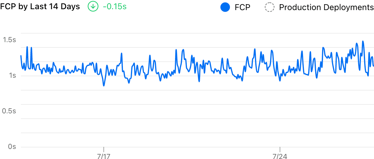 Sidenote: Our old analytics visualization.
It’s hard to read the trend from that chart because it’s too noisy. And the delta showed a -0.15s decrease, which clearly felt wrong. With the improvement introduced, it now uses a smooth curve to visualize the trend and measures the delta more accurately:
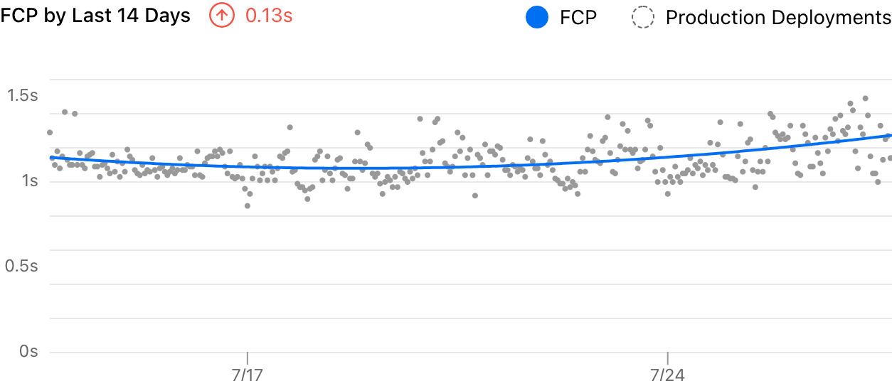 Sidenote: Improved chart with the same data.
#The Challenge
There are two main issues with the old visualization. First, it displays all data points on the chart and this makes the chart noisy. Second, the delta number was calculated by subtracting the last and first sampled data, which is quite unreasonable:
While it shows “-0.15”, all the data in between were completely ignored. As long as the most recent data point behaves better (could be one visitor with an extremely good network connection), the chart will conclude that my website is performing well.
After some research, I found that curve fitting is a simple way to solve both problems: we use a curve to represent the overall trend of our data in a time series, with as few noises as possible.
#Curve Fitting
To demonstrate, I built an example that uses the palmerpenguins dataset to visualize the relationship between the bill length and depth of sampled penguins. It’s a bit noisy just like our Analytics chart:
There are many existing algorithms to calculate the fitting curve for a given set of data points if you already know the type of curve that you are looking for. The easiest way is to do a linear regression: finding a straight line to describe the data:
Linear regression is just a special case of polynomial regression where the order is 1. You can drag the slider above to see how different polynomial orders affect the fitting curve.
When the order is N, the polynomial function will have a degree of N, and the curve will have N-1 turning points (so 1 is a straight line).
And the MSE (mean squared error) value measures the goodness of the fit of the curve to the data, by definition it’s:
The smaller the error is, the better the curve describes the given data.
Usually, the easy solution would be manually choosing a reasonable order and hardcode it in our visualization. That’s what a lot of people do and in many cases, it should be okay. However when we don’t know the behavior of the data (is it constantly increasing or decreasing? is it periodic?), it’s hard to choose a good order.
As you might notice, a higher order will result in a more “accurate” curve with a lower error in general, but it also results in a more noisy curve because it can turn more times to follow our data, and our data has noises! This is called overfitting.
You can play with the example below: it generates fake data points with some normal distributed randomness and then calculates the regression curve for it. For the “Constant” data set, it’s better to just use a straight line to fit (). However, for the “Quadratic” data set, selecting will result in a better curve (and it’s stable).
#The Good Fit
All the examples above shown a general idea. A “bad fit”, or an “overfit” curve, might describe the current data set well, but when you regenerate the data, it will not describe the new data very well.
That is, a very foundational concept in Machine Learning and Data Science, to split the data into a training set and a test set. The training set (the current data) is used to train the model and calculate the regression curve, and the test set (newly generated data) is used to evaluate how well the model works. A good fit for the training set should have a low error on the test set, too.
In our real-world problem, we don't actually have a training set and a test set (we can't generate these random data) and all we have are the numbers collected from our production. But we can simply choose some data points as the training set, and the remaining ones become the test set. To make the algorithm deterministic, I splitted our points by odd and even indexes.
As shown in the example above, we use the training set to calculate the fitting curve and measure the error for both the training set and test set. If you increase the order, the curve tries to follow the points, but the gray lines show the error for points.
Ideally, a good fit should have a low error for both sets, as it shouldn’t be overfitting only the training set. Hence we use a simple but intuitive equation to measure the “overall goodness” of the fit for the entire data set. Usually, when we increase the order of the polynomial regression, the error will decrease (underfitting), hit a good fit, then increase again (overfitting).
This chart shows the overall error when the polynomial regression order increases. It’s clear that when the order is 2, we have the best fit for the entire data which is what we can feel intuitively from the interactive example.
Finally, we can use that regression curve for the actual visualization and estimation. This adaptive approach is very simple, easy to implement, and turned out to be working really well for our case. Again, here’s a before/after comparison of the visualization:
The delta (+0.13s) is much more accurate now, and the curve clearly shows the trend of the data. Meanwhile, the exact data points are still presented to indicate the actual distribution.
Read about this product change in our changelog and follow other updates!
#Appendix: Future Improvements
While this already solved our problem, I still found many other opportunities to further improve it when I was doing the research. One idea is to switch to Locally Estimated Scatterplot Smoothing (LOESS) with a large bandwidth instead of polynomial regression because it is “local”: website performance will unlikely to continue grow in a “predicted direction” unless a change has been made, it will instead be mostly stable.
But at the end of the day, I believe that we need more time and experiments to make that decision since there is no single solution to all problems.
#Special Thanks
Thanks to Linghao and Yiming Chen for proofreading. And thanks to Guillermo Rauch for correcting a mistake.