Good Design

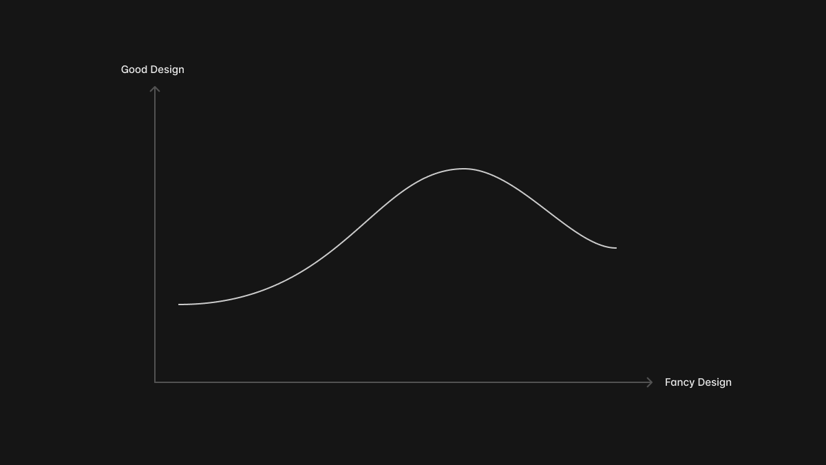
The other day I was chatting with Paco regarding this matter. Sometimes, we have devoted excessive attention to extravagant elements, disregarding the ultimate goal. The term “fancy” can be substituted with various other aspects. In general, the quality of a design does not escalate proportionally with its complexity.
Over the past few years, we have consciously abandoned embellishments such as lights, shadows, and textures in our UI designs. Nevertheless, we are now gradually reintegrating them. This shift should not be misconstrued as a regression from the era of flat design or a reembrace of skeuomorphic design; instead, it represents a progressive leap propelled by a deeper comprehension of design principles.
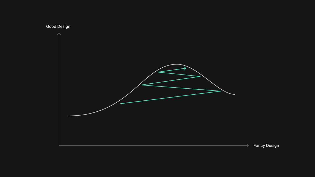
It’s like the simulated annealing algorithm. Iteratively, we move and assess, repetitively striving to approach the optimal outcome within our reach.
Regrettably, the pinnacle of “good design” depicted on our preceding chart is a perpetually shifting target. Monotony inevitably creeps in, causing periodic dissatisfaction with the same aesthetics. Moreover, the landscape of design undergoes rapid transformations. The notion of a “trend” characterizes the prevailing manifestation of exemplary design within the collective consciousness.
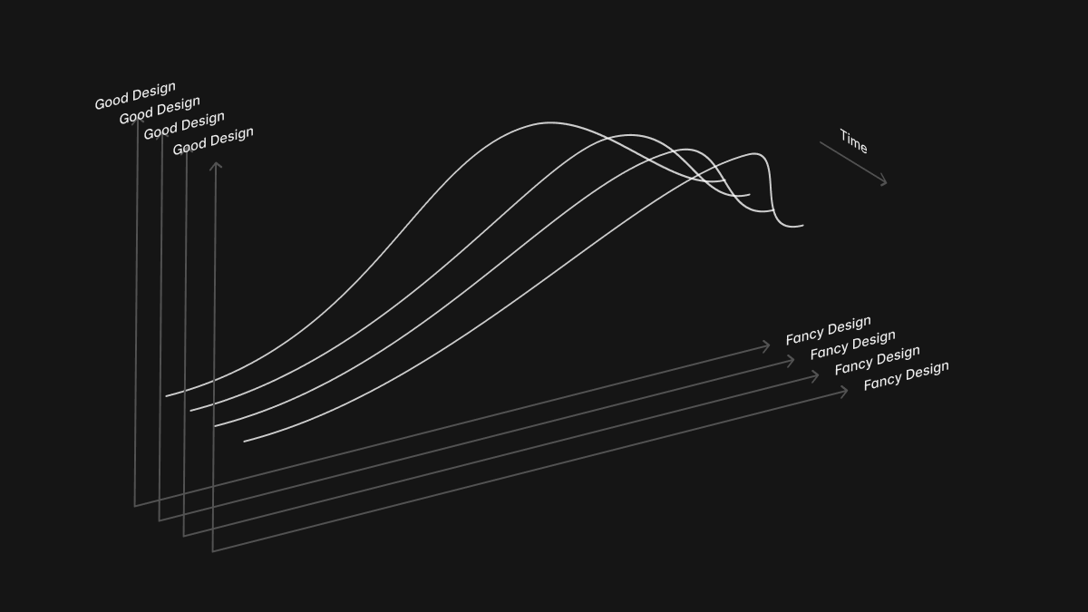
The critical variable here is time. When we pursue the trend, we are essentially chasing a moving target. Each year, we create novel designs for familiar concepts, not as enhancements, but as an allegiance to the trend.
I aspire to disentangle time from my design process. My intention is to cultivate a more profound understanding of design itself and unearth the elusive essence of good design, which transcends the confines of the past, present, and future. In the immortal words of Dieter Rams, good design is timeless.